
經營青年旅館好幾年
大廳 或稱common area, lobby, 絕對是”青年旅館的心臟”
After running our hostel for years, we know that the lobby, or the common area, is most definitely the hub and the heart of a hostel.
而這兩三年台灣旅館業開始風行青年旅館,設計旅店,文創旅館,在地特色民宿……
Over the past 3 years, hostels, design hotels (boutique hotels), cultural and creative inns, and B & Bs featuring local specialties, all have been springing up like mushrooms throughout Taiwan.
旅館間的似乎已經淪為 設計的競爭/價格的競爭 這兩類
其實都是錢的競爭,只是前者是很多錢堆出來的搶客,後者是房價流血賠本的搶客
二星級用三星級的成本卻是二星級的訂價,甚至青旅用三星級旅館的成本卻是青旅的訂價
市場的歪風,消費者也不必了解這些,反正撿便宜就是
Our experience and research has helped us to understand what differentiates a hotel and attracts customers is the design or the price. Both involve money. Either you spend insane amounts of money on design and construction, or you are forced to engage in a price war.
回頭看看自己,經營邁入第五年
硬體設備改善是當務之急要做的
As we stepped into our 5th year of creating a home for hostellers, enhancing our physical facilities became our top priority.
消費者是現實的,連我自己也愛看起來美的東西
我不願意只設計看起來美的大廳,我要美的又有靈魂,我要美的又有靈性獨特
設計很美卻沒有氣氛,就是人看起來眼神空洞,沒有悸動
也就是會願意選擇你多看兩眼(初次入住),但絕對不會繼續跟你交往,下一次不會再回來住,轉而又挑別的正妹(旅館)去了
Everybody loves beautiful things. Yet,‘looking pretty’ is not sufficient for us.
Understanding travelers and their wants and needs is what makes our ‘beautiful’, beautiful, meaningful and functional!
Our ultimate measure of success is when our guests keep coming back and stay loyal to us, so we desire a lobby, the heart of our hostel, that emits its own story, possesses its own unique personality traits, and creates heartwarming vibes.
什麼叫美的又有靈魂?
設計加入使用者經驗,設計師願意花時間了解青年旅館產業特性,設計師願意花時間想創意
然而,預算 預算 預算
我沒有辦法花三星級旅館用的成本,卻是青旅的訂價
像是我買不起LV外衣,我無法容忍已經是個卡債族,一隻三萬的iphone還是刷下去
So how could we achieve all of this without exceeding our budget? Although all it takes is a beautiful design based on guest experience, a unique design is actually really hard to come by.
蓋一間旅館
最難的部分,應該就是想出一個獨一無二的設計
最難卻也是起頭,起不了頭後面都別談了
有人說,花錢就可以解決了。
美的設計,也許可以,但 好的設計,不一定是花錢就買得到
尋尋覓覓,後來我們找到了一位泰國設計師,泰國設計能力在整個亞洲中是有目共睹的,從泰國旅館設計便可知一二
設計師尋找我花了三個月,設計的討論我花了半年,製圖花了兩個月,工程花了兩個月,前前後後歷時約一年
(其間包括房間的改造,下篇再詳述)
與設計師在設計的發想,創意的激盪,加入我自己又是業主又是使用者的經驗
完成了homey hostel 紅米青年旅館的大廳設計
大廳坪數約三十幾坪
After our extensive research, we found an incredibly talented designer from Thailand who was willing to attentively listen to our needs then devote a great amount of his time and energy to creativity. Together we did a lot of brainstorming by considering my dual roles as a hostel owner and a backpacker with plenty of worldwide hostel experiences.
The entire 100-square-meter lobby renovation process took about one year to finish, including three months of searching for the designer, six months of design discussions, two months of drafting and drawing, and another two months of construction.
此次改造設計著重四點
1. 氣氛- 設計 / 燈光
2. 彈性- 傢俱 / 空間變化性
3. 連結- 人與人之間的連結
4. 創意- 無價
Our priorities in renovating the lobby were:
- Building connections among people
- Establishing ambiance through use of lighting
- Creating flexibility and diversity in space use, with moveable furniture and integrating platforms at varying heights
我跟設計師說,青旅的精神是人與人互相交流 『連結』
旅行的過程,幾年後能記得的可能不是中正紀念堂的衛兵交接,而是那晚在青旅遇上的夥伴
青旅大廳必須身負著這樣的功能,讓人容易聚集,讓人想要流連,幫助創造回憶,讓故事每一天都在這發生
我要透過設計,讓客人自然而然便於互相交流,我要透過設計,讓客人愛上這個空間
而這幾年台灣青旅越來越只著重於裝潢,卻忽略了青年旅館的宗旨
青旅大廳在我腦中的圖像是,偷閒的空間,放鬆,賴著不走,慵懶,交誼
想像著有個背包客,他沒有既定的行程早上就賴在大廳裡看書,下午穿著爛爛的夾角拖或是布鞋,用徒步的方式四處走走,晚上跟剛入住的室友一起在大廳喝酒,馬上就跟隔壁座位的人認識相約明日一起去九份
這就是所謂『連結』
Our philosophy is, a hostel’s mission is to connect people.
Unfortunately, while the number of hostels in Taiwan has increased rapidly, the focus of running hostels has shifted to enhancing the appearance, for appearance sake only.
At Homey, we believe our lobby should serve its purpose to gather everyone, encourage and ensure positive interactions, and create memories that make *you* smile.
Through design, our greatest wish is to help hostlers connect with each other, so we have designed and created the perfect space for this to happen. 
青旅大廳同時也必須是複合式的空間,
早上像是咖啡館,輕柔的音樂,陽光灑進,緩慢的步調,跟窗外車水馬龍相互對比
或者像書店,館內的旅遊藏書,或是自己背包中那本跟著你流浪的書,找個角落,就這麼靜靜埋入書香
晚上變身酒吧,大夥兒買食物與酒一起分食,跟著快節奏音樂情緒也越來越激昂,同桌的 2個變4個,4個變8個,喝個酒就認識了5個人
青旅大廳又得像餐廳,早餐午餐晚餐,有多少人都在這個空間。廚房更是畫龍點睛做飯交友,問聲需要幫忙嗎?洗菜跟切菜原本互相不認識的人也能聊開了
但也脫離不了網咖的面貌,畢竟現代人旅行中還是需要回些公事
所以青旅大廳的變化性是需要非常彈性的
Regarding a lobby’s features, both flexibility and multifunction are necessary and crucial. For example, our lobby can be a café or a library lounge during the daytime, and in the evening, turns into a lounge bar and inclusive hangout. It includes a kitchen as well, in which not only various international dishes are made, but also numerous international friendships. For business travelers, they are able to feel comfortable using our lobby as a workstation.
進一步的說
旅館要抓住一個新的客人,必先從『視覺』,燈光,設計
人都欣賞美的東西,新客人對於『homey』這個字沒有情感連結,所以我需要他幫我設計的漂亮抓住新客人的眼睛,而設計中希望他加入我描述給他的青旅大廳功能性與實用性
透過設計,無形中控制客人的行為,客人進門辦入住自動會在哪坐下,抱著筆電會坐哪?帶本書會坐哪?四個人會坐哪? 走去洗碗會走哪?廚房煮飯轉身是冰箱很方便 等等等等等
然而
部落格當道,能用照片最容易呈現出來的是裝潢
青旅的溫度,反而較難用照片呈現
客人與青旅感情的連結較難用照片呈現
但我希望設計師透過設計,能盡量讓照片也能呈現溫度
(其他五官感覺聽覺 味覺 觸覺 感覺 是有關青旅營運,下篇介紹)
Those who have stayed with us at Homey, already have an emotional attachment to us. In order to capture new customers’ attention, our lobby has to be more than just visually appealing. It’s photogenic quality must also capture the truth of welcoming warmth when viewing our photos.
討論在設計師飛來台灣後開始進行
親眼見到親身體驗青旅,他可以比較了解我在講什麼
過了不久提了第一次提案
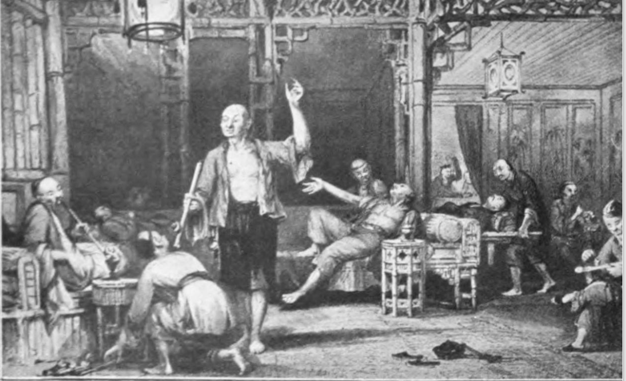
他提了一個概念是 “鴉片館”
想想古代鴉片館,不就是一個偷閒交際的地方,隨性的或坐或躺,下圖的確有這樣感覺
Discussion began since the designer’s first visit to Homey. By exchanging thoughts and communicating ideas, the design concepts of our lobby were then born.
As the following picture reveals, an old-time Opium Hall delivers such feelings of laid-back and sociable, where you can either casually sit anywhere to talk with others or just comfortably lie down.
空間設計,在『連結』的思考下,設計師提出了功夫熊貓場景的想法,即使是在廚房裡,也是能與庭院的動物們交流
Another concept is inspired from the animated film Kung Fu Panda, where everyone in the open-concept kitchen still feels included and inseparable from the lobby, as well, they can still easily interact with those in the courtyard.

各個小地方,但無論待在哪個角落,你不會覺得你失去與這個空間的連結格格不入
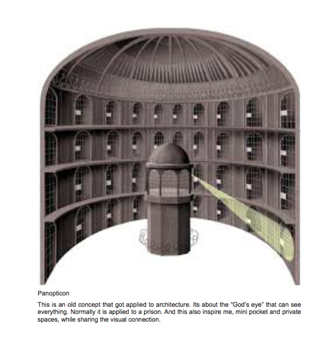
或者像是古代的監視台
站在那升高的平台上,你都可以觀察到各處
And, just like an ancient Panopticon, its God’s eye is perfect for overlooking or observing everything happening right there.
Our mission ‘connection’ is reflected in all of the abovementioned concepts. No matter where you are in this space, it’s impossible for you to feel left out!!!
一年後,終於完工了
引用旅館界的前輩分析未來旅館的趨勢與風格
這次紅米大廳走的是輕奢個性化風格
一進入大廳,會覺得氣派,尤其晚上打燈更顯氣氛,高低水平,也凸顯了設計不太按常規走的個性
After a yearlong renovation, Homey now has a modern, stylish and inviting lobby, looking particularly delightful during the night with its thoughtful and expressive lighting. The asymmetrical design details also give it a distinct personality.
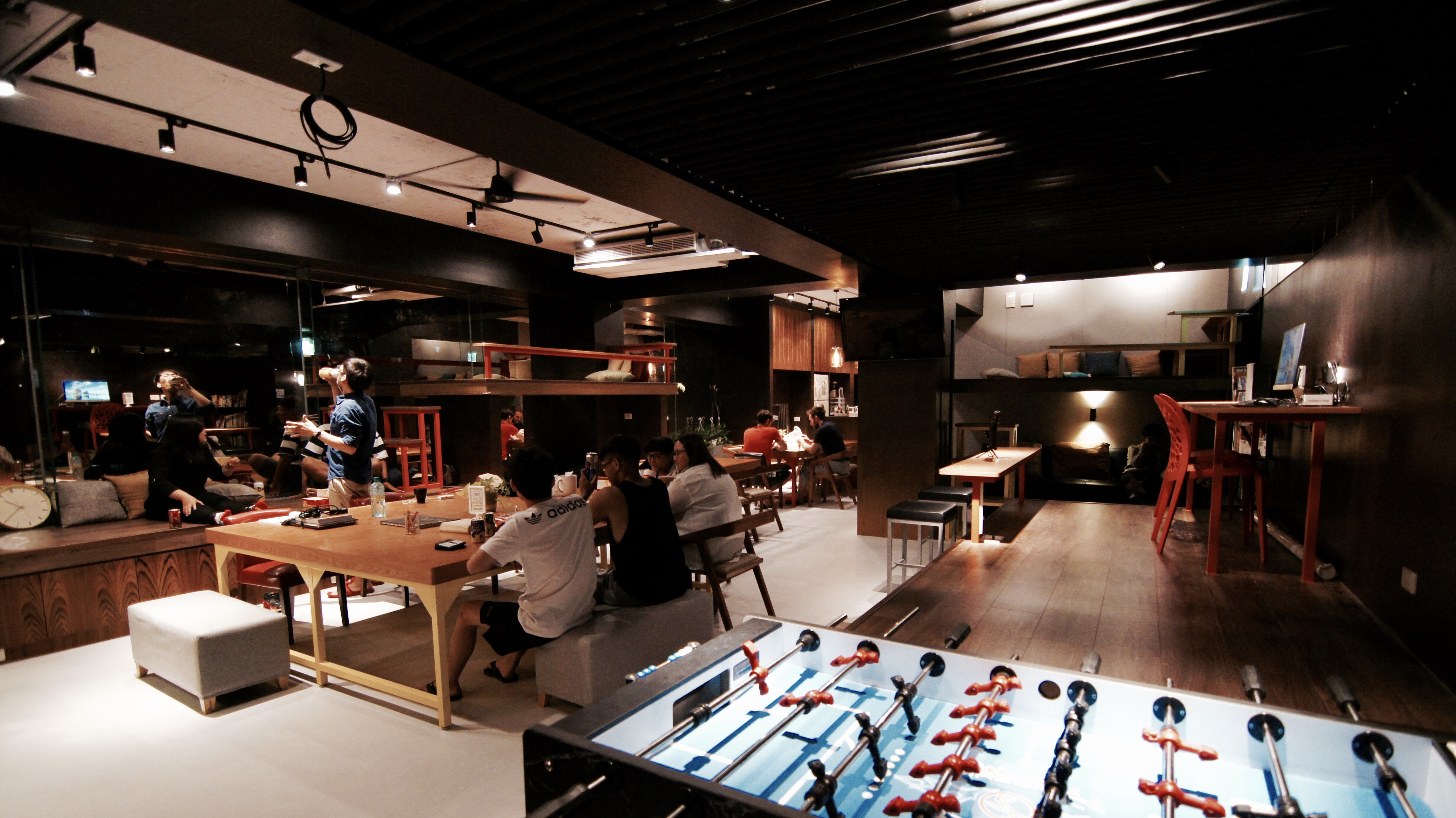
大廳全景- 透過高低的平台,視覺上看起來有創意,空間也增大了
Nighttime Overview – Our lobby feels more spacious through the creative design of multiple raised platforms.

大廳全景- 白天
Daytime Overview

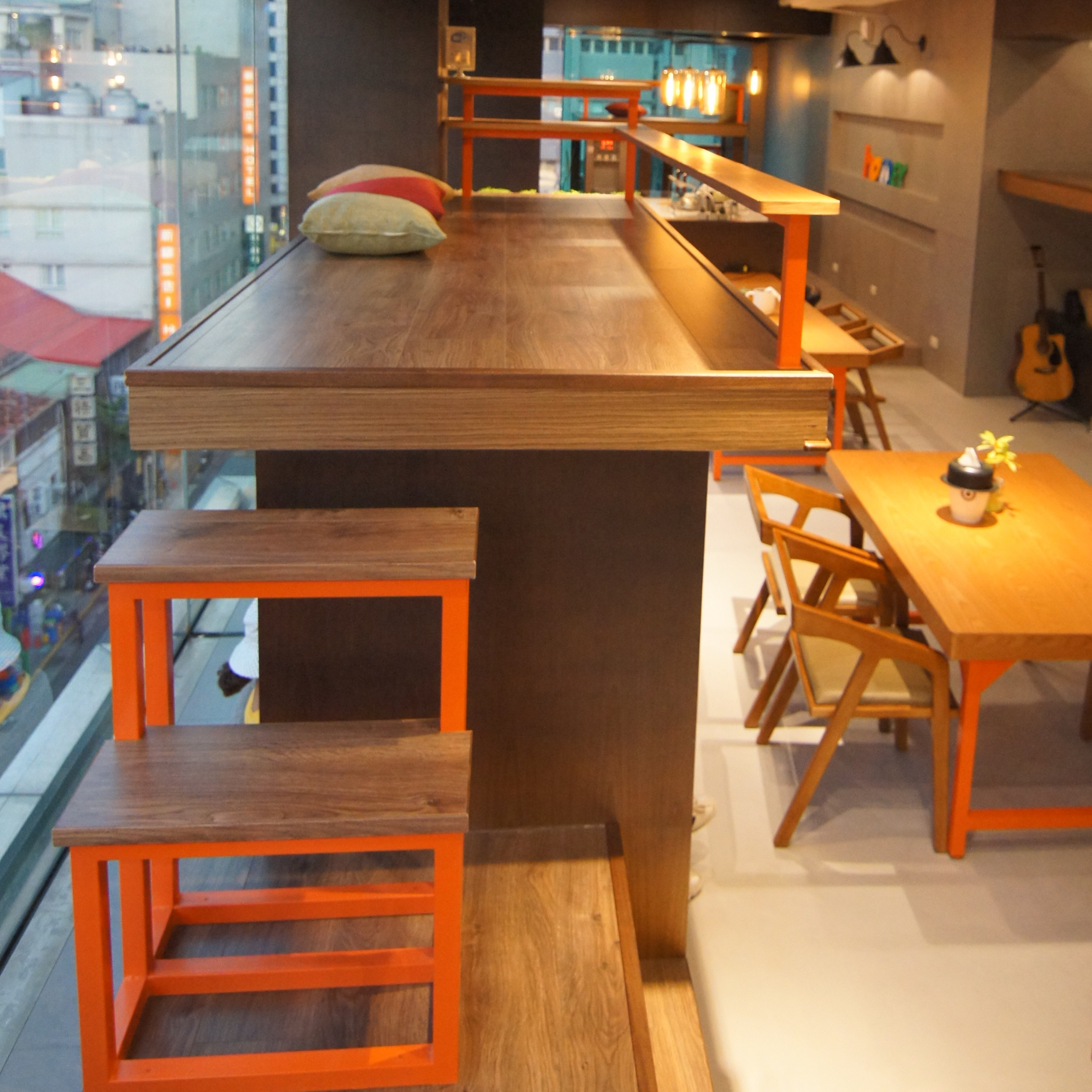
平台1- 適宜的高度,讓人很容易會直接坐下,寬敞,可或坐或躺。靠窗更能感受居高臨下遠眺市區城景(鐵皮屋頂,獨特的台灣建築)
Raised Platform 1 – The perfect height of this platform makes it a comfortable seat. Sitting next to the window, you have a birds-eye view of Taipei’s busy city streets below.

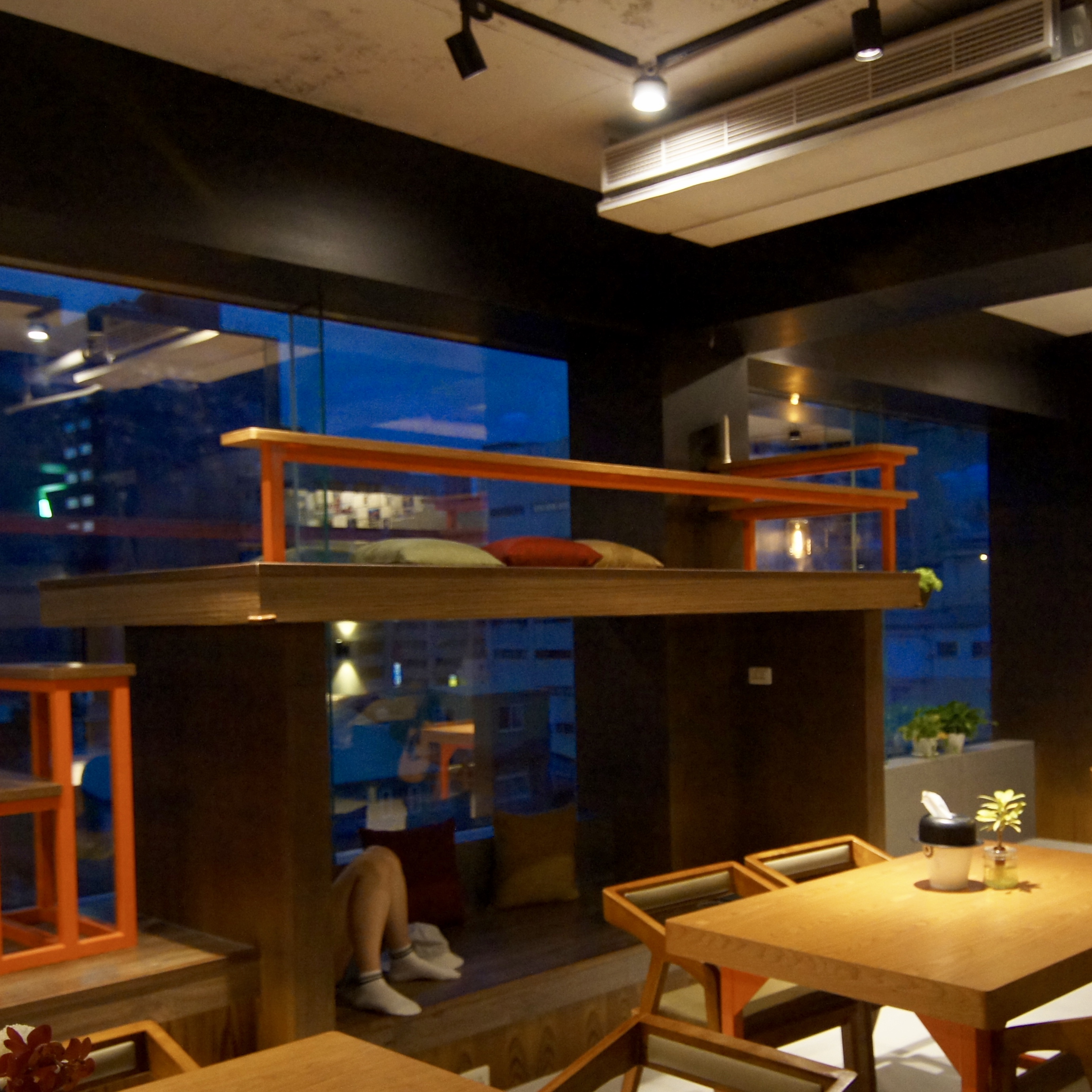
平台 2 – 屬於兩人的樓頂小空間
Raised Platform 2 – Creates an exclusive loft perfect for 2.

平台上設計小桌子,方便書寫明信片日記
A side shelf built along the platform allows you a place and space to write. (Perhaps write us a postcard for our Postcard Wall – See Platform 4.)
平台下方有個空間,可以安靜的在這個角落看書
Beneath this raised platform forms a cave where you can relax yourself for reading.

正中央有一張大桌子,可以坐滿10人以上的party沒問題
In the center of the lobby, there is a massive square table, big enough for a party of 10-plus people.

舞台區,青旅大廳辦活動,同樣也是公用電腦區。也便於退房的旅客整理行李,不用再蹲著把行李箱打開攤在地上了
Our computer area doubles as a stage when we hold events and it’s a planned and convenient place for our guests to organize their belongings. (Because at Homey, we try to think of everything…and if we’ve missed something…let us know!)

彈性的傢俱,兩張長桌必要時可以結合在一起,長桌座位相近也利於人與人的互相交流
Movable furniture lends flexibility to the lobby and to our guests requests. By combining two tables into one, more people can gather and have fun together.


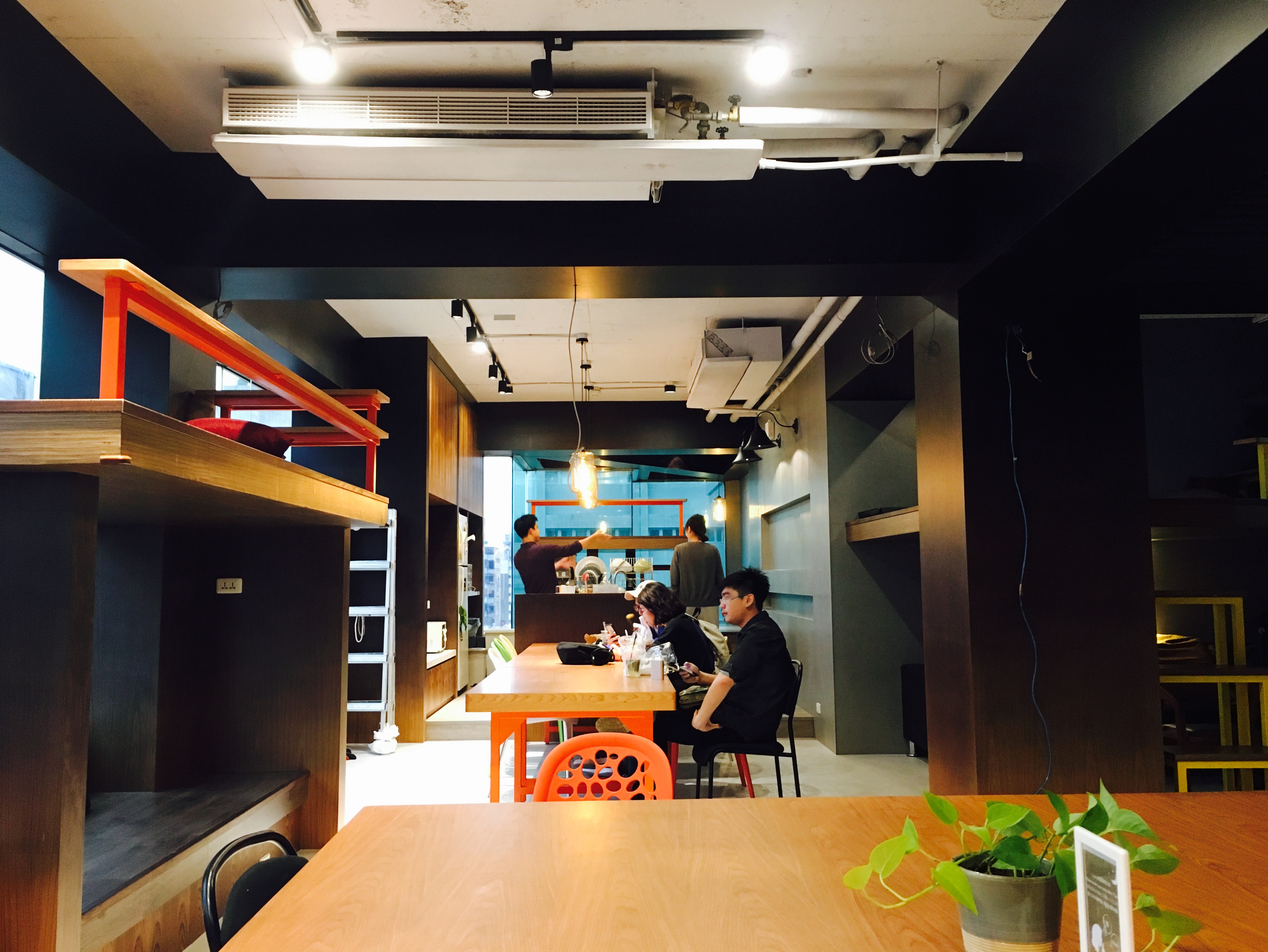
廚房- 重點區域。紅米常常舉辦做菜活動。開放式的廚房並不會與其他空間隔絕。兩個洗手台,分流客人
The walk-around and open-concept kitchen is a really important addition for Homey because we host dinner events OFTEN. Opposing sinks help avoid kitchen traffic jams effectively.
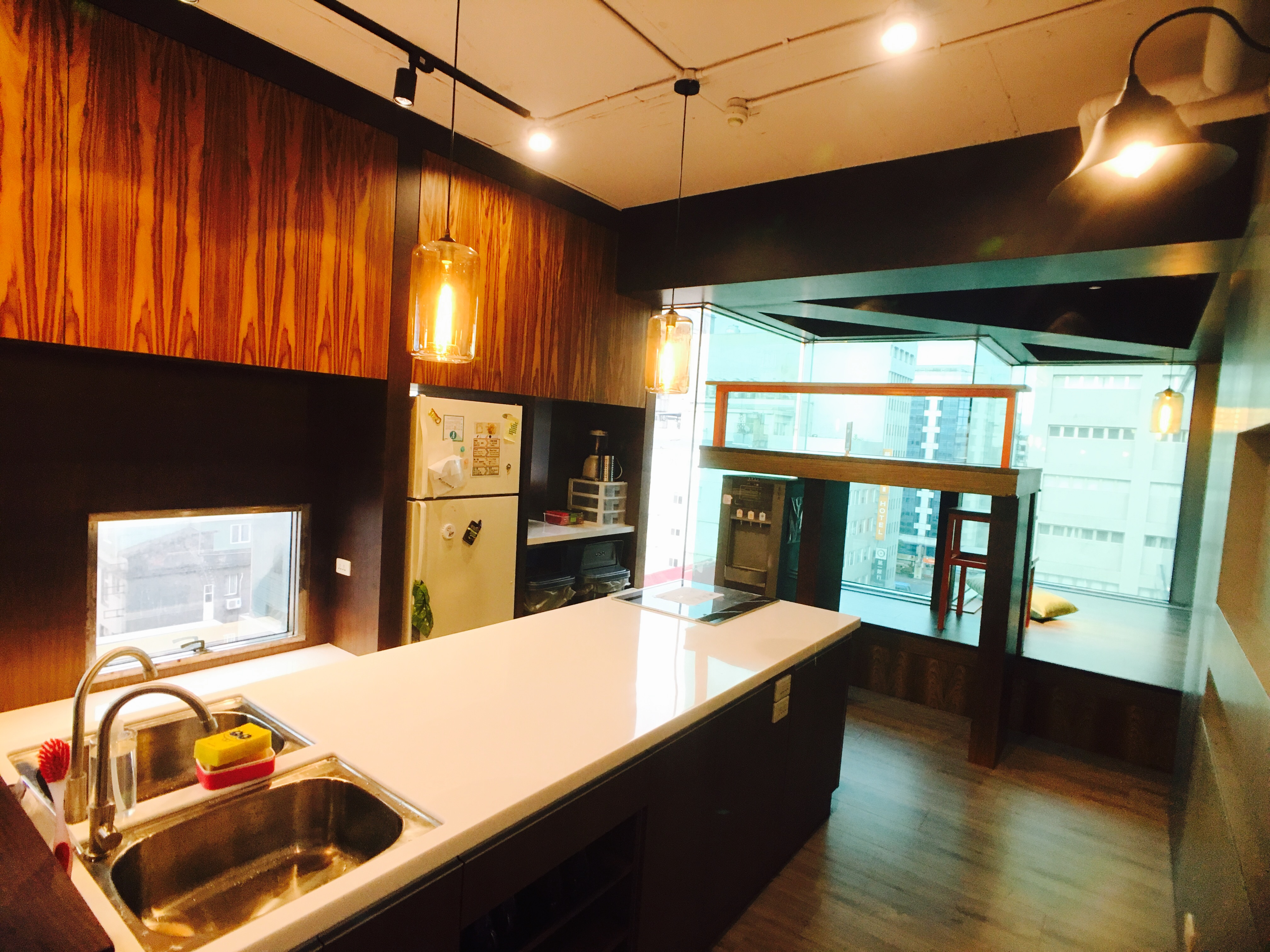
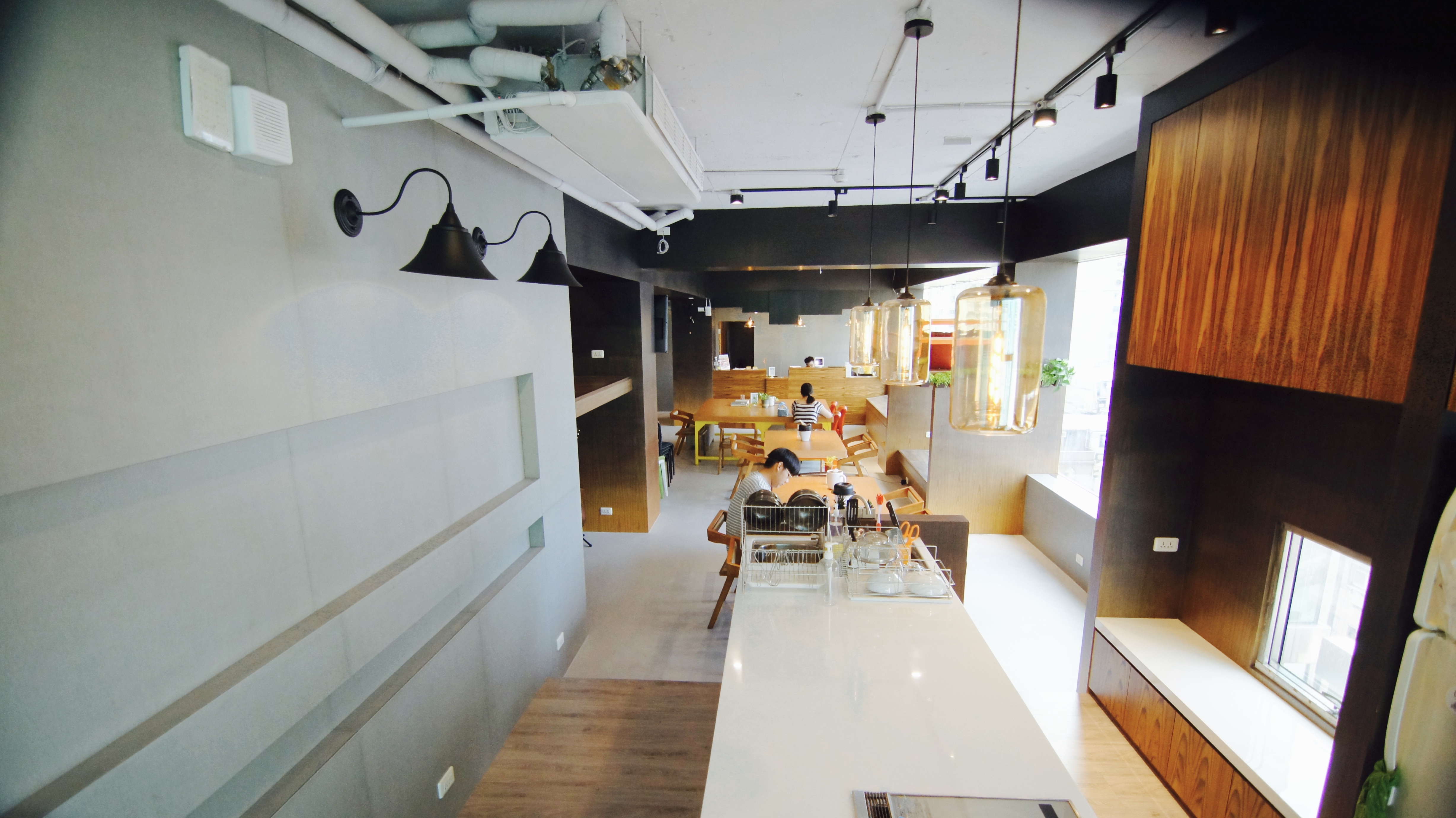
長桌- 討論會議方便。也緊鄰廚房中島,上下菜方便,又可以隨時與做菜的人敬酒
The multipurpose long table is not only suitable for business meetings, but it’s strategically placed directly next to the kitchen which simplifies the serving of food, for social meetings.
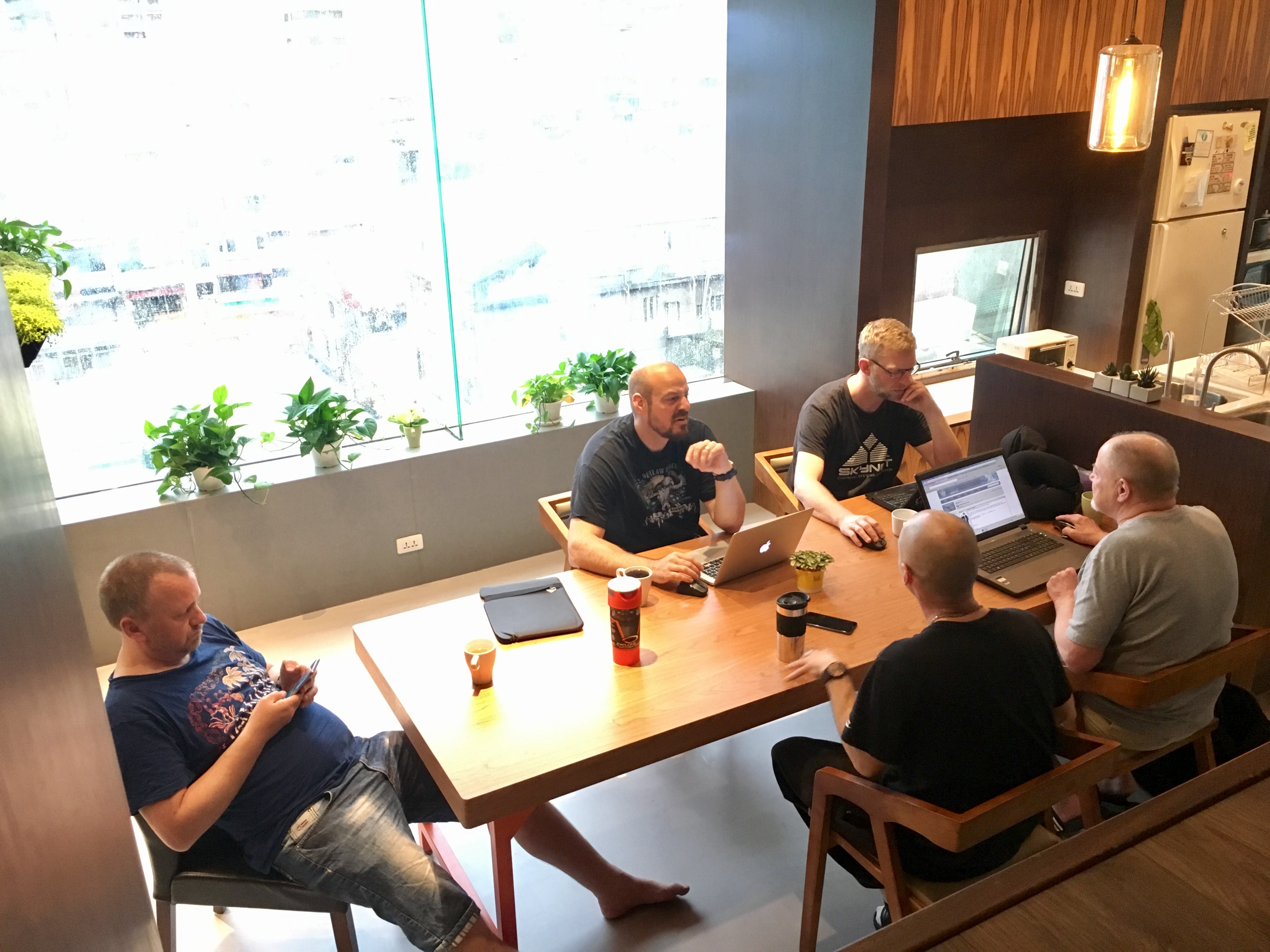

廚房後區的小平台- 隱密彷彿是自己的小基地,卻能眼觀大廳動態
Raised Platform 3 – Hidden behind the kitchen, this proves to be a perfect Do-Not-Disturb spot for those seeking some privacy, and from this vantage point, you still get to see everything happening throughout the lobby.


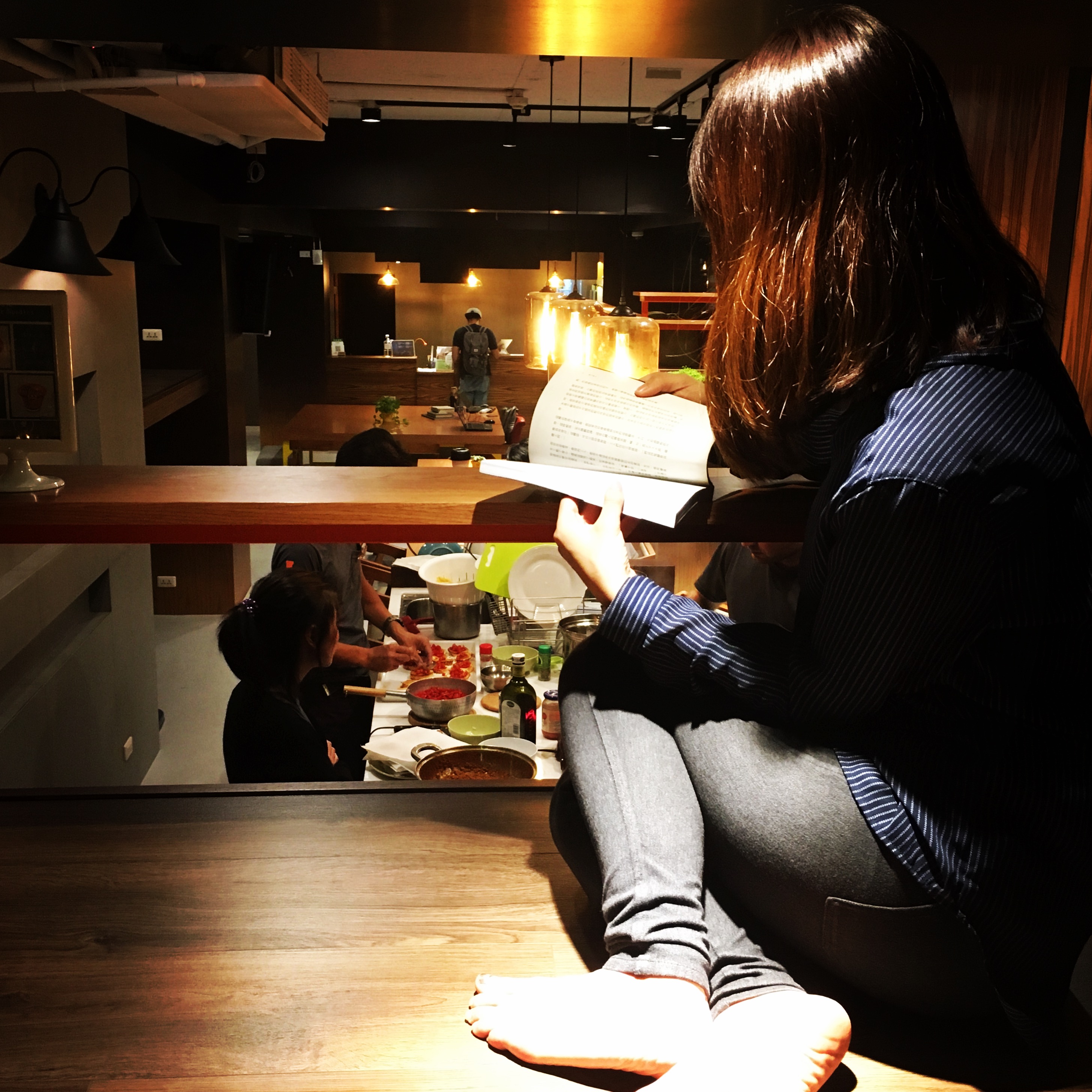
最佳賞景處
This also happens to be THE prime viewing spot to check out the city.

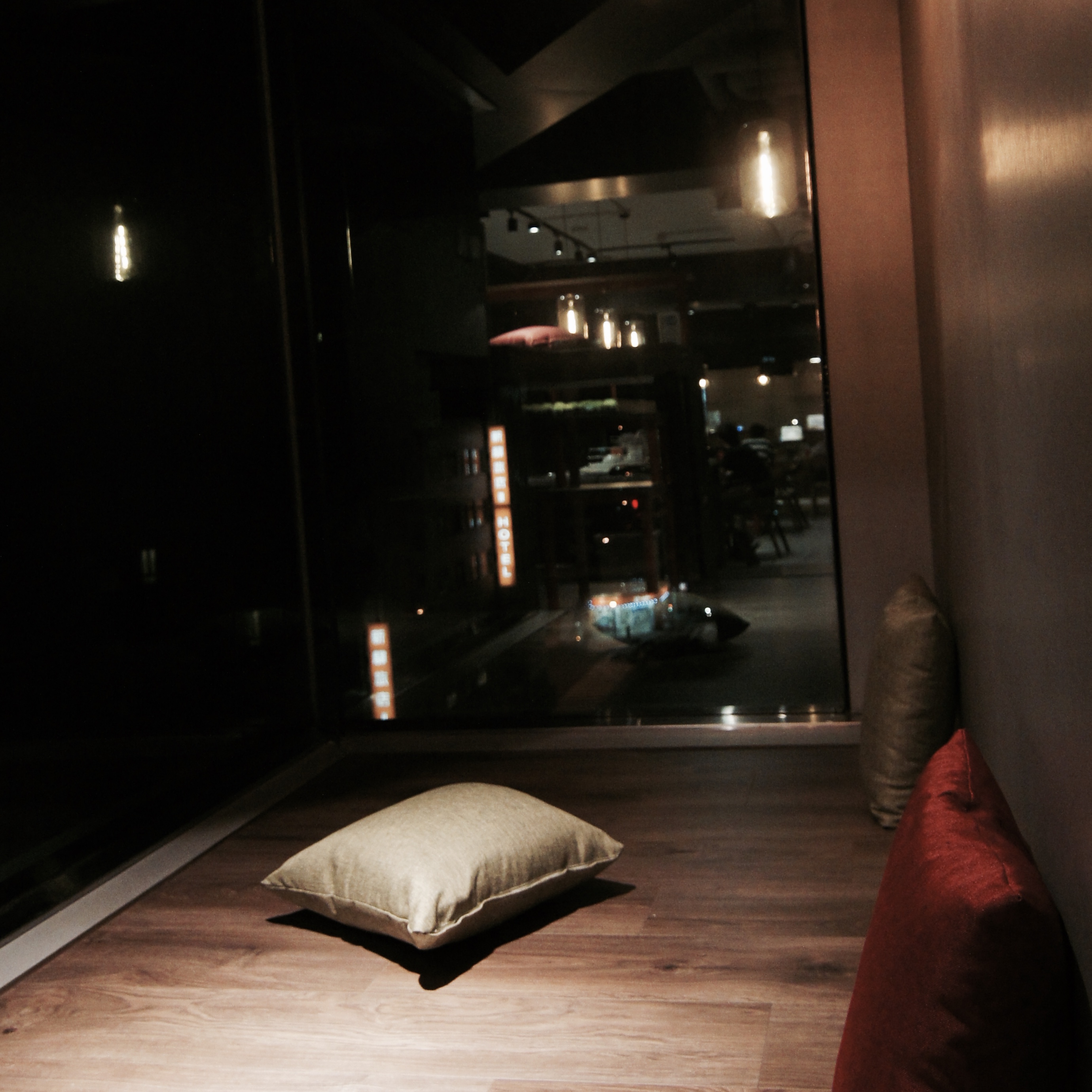
最大平台(右側)- 回憶區,寄封明信片給紅米
Raised Platform 4 – Includes our featured Postcard Wall. (We invite you to add to our growing collection of personal feedback and appreciation.)
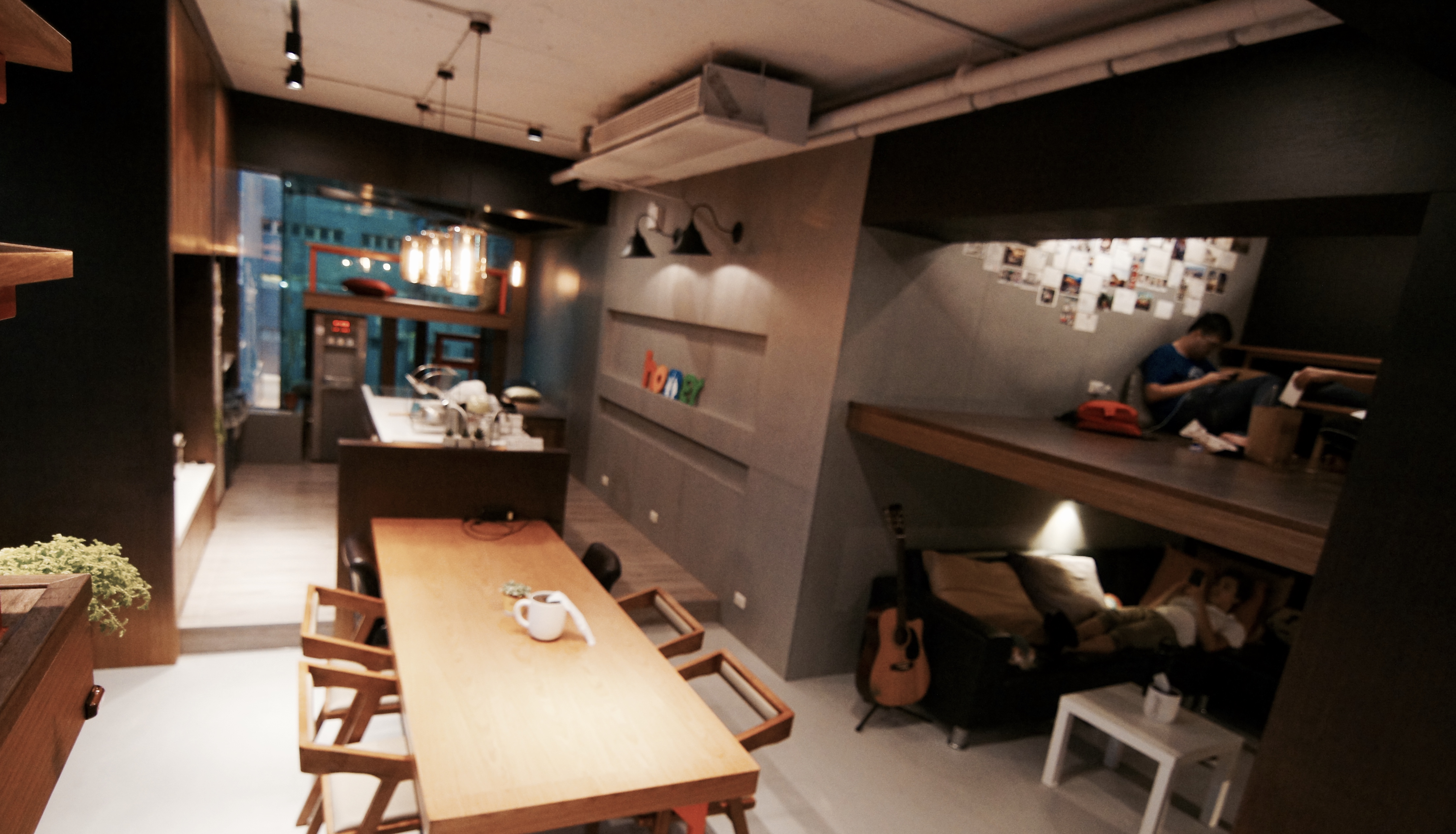

綠色植栽-增添生機
Greenery infuses life and wholesome energy into the lobby.

櫃檯- 不規則的形狀,跳脫制式
Your first moments at Homey begin here, at our ‘considerate’ front desk, designed with detail, accommodating all heights of all guests.
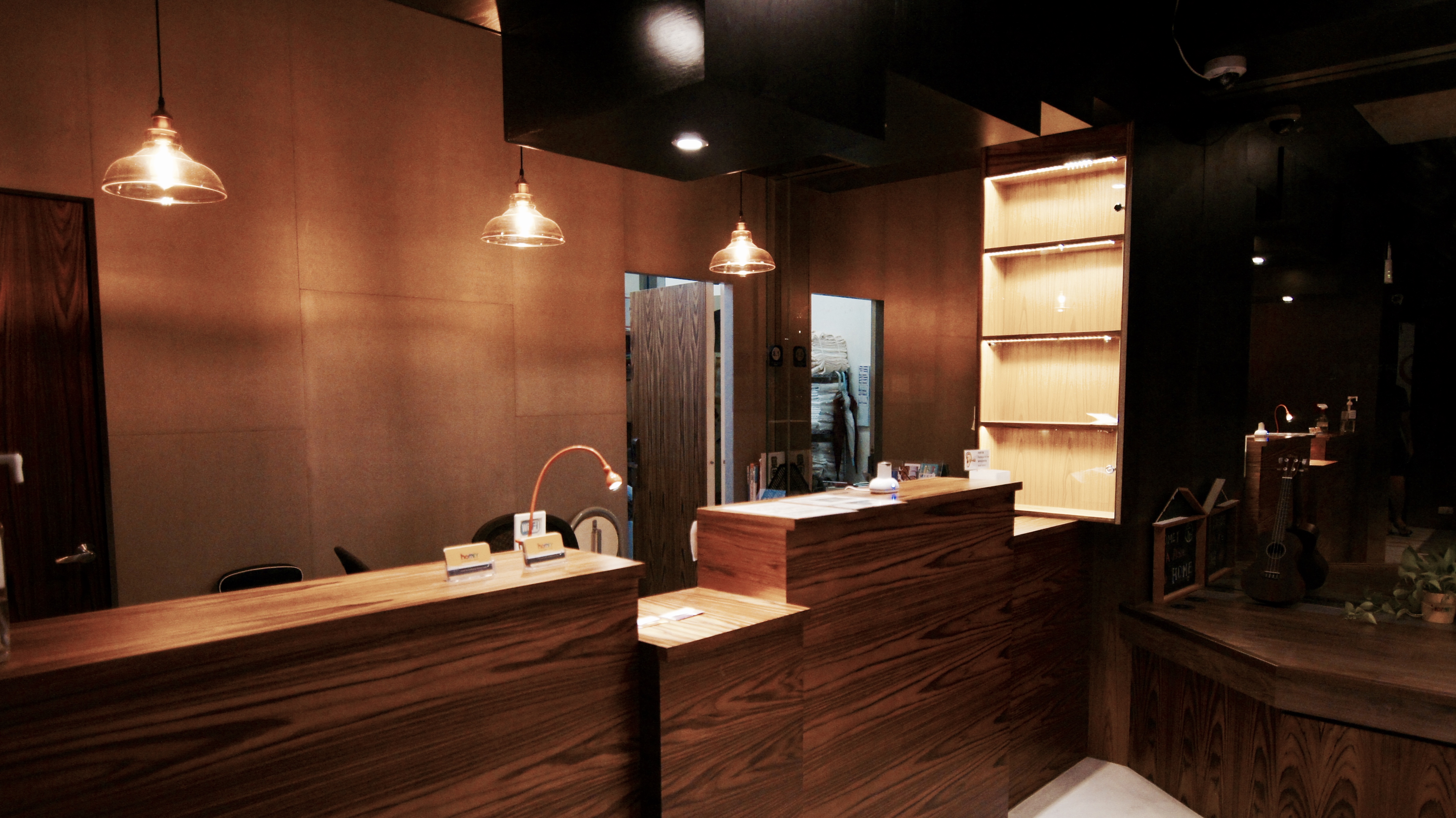
辛苦了好久,掌控預算下終於完成了
希望值得,謝謝這期間幫忙的所有人
Homey’s renovation is now complete, AND within our budget! We’ve done this for you and because of you! And we want you to reap the benefits of our time, energy and efforts!
We extend huge gratitude and appreciation to all who have contributed and input to the process of transforming our lobby…the Heart of Homey!
再看看更令人動心的房間設計背後的故事吧
Go to see more attractive behind story about room
台北平價住宿紅米青旅床位樓梯設計 Taipei homey hostel dorm bunk bed stairs designing
設計:Itthi Poldeenana / 蕭凌雲 Kelly H
4 Pingbacks